equilibrium
— issue #13 {May 2015} —
.editorial
Hello, and welcome to the thirteenth issue of Equilibrium.
In this month's editorial, I'll "cheat" in a way, since I won't publish an original story as I usually do, but instead I'll post a part of an article I published a couple of years ago, which -unfortunately- is still relevant.
It is about pagination in articles published on the web, something that I find annoying. You know what I'm talking about, it's when you visit a "15 hilarious cat fails"-type article and you have to click a button each time you want to view the next photo. Unfortunately, serious websites (not that I have anything against cat photo websites :P) go through that route as well. I even linked to one in the last issue. In their case, there is a "View All" option, although you can't directly share the resulting URL.
This whole concept reminds me of a printed newspaper, where there are space constraints that makes you have to turn pages to read the longer articles. But, in my opinion, paginated articles on the web offer nothing of value to the user. At least not in the way they are implemented most of the times.
Usually, pagination is implemented in a way that favourites only the website where the article is published. How? By providing more pageviews. At least this is the theory behind it, because in practice it has the potential of driving a lot of people like me away. That’s all; I really can’t find any other advantages, either for the user, or for the website.
Most importantly, I cannot really see a benefit for the user, who has to do the following to read the next page of an article:
- click;
- wait for the page to load;
- and, finally, scroll down to find the article (since usually there is not an automatic focus at the beginning of the content).

The worst of all (which happens quite often to me) is when you need to go a few pages back and read again a part that you read before. It’s a complete mess, and that’s when I usually give up and leave the page.
Even if I don’t give up and continue to read the whole article, all the above make me lose my coherence while reading. I find it extremely easier and convenient to scroll down while reading, the way we’ve been doing it for several years. Let alone it helps in printing (if there is no print view) and possibly in sharing (I’ve never printed an article from a website, but it’s still a valid case).
Although I find pagination in articles unnecessary and distracting, that probably isn’t the case for everyone. So, if you are going to implement a pagination system, then please try to make it user friendly.
For example, you can load all the article in one page, and “break” it into pages afterwards, using JavaScript. The general concept of pagination won’t change, but at least you’ll solve some of the above issues.
This way it is very easy to implement a "switch to complete view" solution, so people can use it without even having to reload the page. Something like that (click on the button to switch views).
Finally, after the page is changed, focus the user's browser on the beginning of the content to minimise the distraction for the reader.
As always, enjoy the issue!
– Stathis
.blogs (interesting reads from around the web)
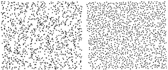
What does randomness look like? — wired.com, 2012

"Here are two patterns, from Steven Pinker’s book, The Better Angels of our Nature. One of the patterns is randomly generated. The other imitates a pattern from nature. Can you tell which is which?"
Git In Two Minutes (For A Solo Developer) — garyrobinson.net, 2014
I'm amazed that I still meet (experienced or not) developers who have not incorporated a version control system into their workflow. If you have friends who always find excuses (e.g. they are busy, or they claim that a "create a zip file with the new version and put it in Dropbox" solution is enough for them), then be a good friend and send them the following article to help them take the first step into the world of git.
Charity — chriscoyier.net, 2014
"I do not want trends to drive my charitable behavior. I want to be charitable toward things I think are important in life."
I Liked Everything I Saw on Facebook for Two Days. Here’s What It Did to Me — wired.com, 2014
"My News Feed took on an entirely new character in a surprisingly short amount of time. After checking in and liking a bunch of stuff over the course of an hour, there were no human beings in my feed anymore. It became about brands and messaging, rather than humans with messages."
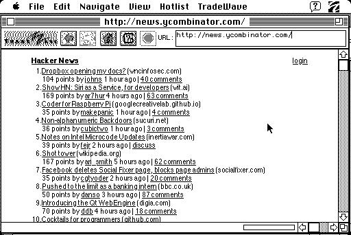
Plugging a 1986 Mac Plus into the modern Web — kernelmag.dailydot.com, 2015

"Sure, it was slow as hell, but it worked! Data loaded, pages rendered, and links were clickable. Even forms sort of worked. Did I mention it was slow? It was slow. Soooo sloooow. Slow slow slow. Like, minutes to read and render a page slow."
.podcasts (sometimes is better to listen)
Full Stack Radio — fullstackradio.com
Full Stack Radio is a podcast for developers interested in building great software products. In each episode, Adam Wathan (the show's host), talks to people in the software industry about everything from user experience and product design to unit testing and system administration.
.tools (of the trade)
Intervention Image — intervention.io
If you are working with images in PHP, Intervention Image is a great library that will help you along the way. It provides an easier and expressive way to create, edit, and compose images and supports currently the two most common image processing libraries GD Library and Imagick. Shameless plug: I recently published a tutorial where I used the library.
.videos (for education or entertainment)
What Does Sound Look Like? — youtube.com, 2014
"I'm going to show you the sound of a clap and I don't mean some digital depiction of a clap. I mean that when this man's hands come together you're going to see something that is normally invisible."
Liverpool's miraculous comeback in the Champions League Final 2005... Brick-by-brick — youtube.com, 2015

Ten years have gone by since the night when Liverpool came back from 3-0 down at half-time in the 2005 Champions League final to lift the trophy, winning on penalties after a three-goal, six-minute burst in the second half brought them level. Here is all of the drama painstakingly recreated, brick-by-brick.
.books (physical or electronic)
The Artisan Files — Volume 1 & Volume 2 — laravel-news.com & leanpub.com
The Artisan Files is a collection of small interviews with developers who are involved in the Laravel ecosystem, although the interviews are not exclusively related to the framework. It is not a typical "tech style" book in that it isn’t teaching you any new skills directly. However, by reading the interviews you can find out lots of interesting information such as daily routines, apps and software that the interviewees use, and -sometimes- little bits of inspiration.
.non-profits (for a good cause)
Kiva — kiva.org
Kiva is "a non-profit organization with a mission to connect people through lending to alleviate poverty. Leveraging the internet and a worldwide network of microfinance institutions, Kiva lets individuals lend as little as $25 to help create opportunity around the world."
By the way, here's a relevant excerpt from Chris Coyier's "Charity" article I shared above: "I use Kiva to help give loans to people around the world that need it. I particularly like the ones where people are starting businesses. I always re-invest what is sent back to me."
.bye
Thanks for reading Equilibrium!
If you've enjoyed reading it, consider spreading the word to your friends (the link is for a customisable tweet).
If you want to contact me, you can reply directly to this email.
Photo credits: "Broken" monitor by Josh Miller; the rest are part of the associated linked resource.
P.S. If someone forwarded you this newsletter and want to subscribe, click here.